

If you’ve never been in a fight over a font choice, then you haven’t really experienced the essence of graphic design before. Five years ago, CERN scientists announced the discovery of Higgs Boson (one of the most important discoveries in the world of physics) using the font millions of people over the world hate. Yep, it was Comic Sans! Needless to say, people were shocked and enraged by their choice of typography. While the scientists felt like the font was appropriate as it made the information seem much more comprehensible to the general audience, the designers thought it just revealed a bad taste. But what is it about typography that is able to wake such extreme emotions in us human beings? And how, for God’s sake, to learn when and how to choose fonts?
1. How do we read?
-
Bouma Shape
A year ago at this time, I was teaching English to young students. And while my own students were already teenagers, I had the chance to observe a couple of preschoolers’ lessons. As most of the students were still about 4 years old, they couldn’t read or write yet. Or at least not in the conventional ways. After being taught a certain set of words by repetitions and observations, they were able to recognize (read) the word when seeing it. Their reading was based on shape recognition and image-like perception. So, say the words they studied during the class were “read”, “jump” and “kick”. Even though all the words had one syllable and identical length, the students were still able to point at one of them and pronounce it based on its shape. They weren’t perceived as separate letters but rather as units. This is called Bouma shape and it comes to show that recognizing shapes is at the core of the reading process.
The Bouma shape is essentially the shape that the letters in a word form. As you can see, the shape changes based on the font and the upper case. Thus, reading upper cases is harder as the word loses its shape as a unit and becomes a set of letters. Of course, this applies mainly when talking about longer texts, and in individual words, the readability usually doesn’t decrease. Still, it’s a good idea to consider the shape of the word when creating logos and titles. You can read more on the topic in the excellent paper by Kevin Larson from Microsoft, called The Science of Word Recognition.
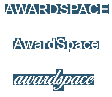
Fig. 1: The Bouma Shape
-
Saccades and Fixations
When reading a text, however, the micro-level of word recognition transfers to the macro level of the sentence. Here we’re not talking about units anymore but about saccades and fixations. As opposed to the common belief, our eyes do not move smoothly on the lines when reading and do not see every single letter in a word. They actually make small “jumps” skipping across the lines, called saccades. At the end of the jump, the eye pauses to take a rest, and snapshot the words. That pause is called a fixation. The whole operation is the natural scan path of reading. We can typically jump through a maximum of 9 letters before we need to pause in order to understand what we read. That’s why it’s not too hard to calculate the ideal length of a line which designers should take into account: 12 words or 50-75 characters.
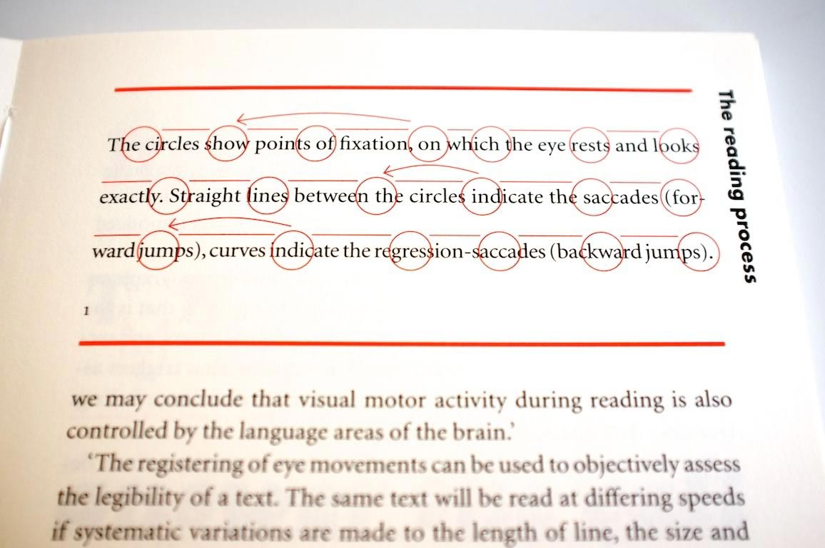
Fig. 2: “Detail in Typography” by Jost Hochuli, Thanks to Jon Tan
2. How do we perceive the content through fonts?
As you’ve probably discovered yourself, our impression of a text can vary depending on alignment, organization, and font used. That is actually why people keep creating fonts and exploring typography – to explore the range of emotions caused by them. By associating certain font families with our previous experience with them, we’re able to easily categorize a piece of content as an advertisement, article, comic, or something else.
When that association turns out incorrect and the font doesn’t match the tone of the content, we can feel frustrated and annoyed. That’s exactly what Kevin Larson and Rosalind Picard tried to explore in their article The Aesthetics of Reading. They created two versions of the New Yorker e-Periodical. One of the articles had high-quality typography, and the other – had a poor one. The result of the research showed that well-done typography can affect the mood and lead to a positive attitude towards the text read. The task was completed in both the cases and the different typography had little effect on common performance measures such as reading speed and comprehension. Nevertheless, the positive mood induced by the aesthetical effect of the better typography appears to impact our general perception of the text.
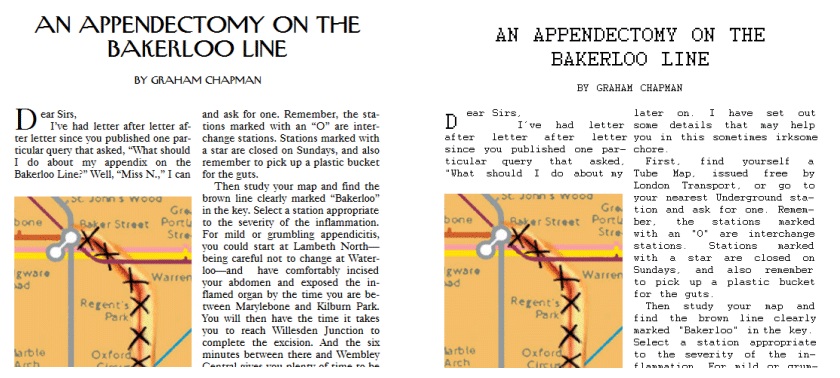
Fig. 3: The two versions of the New Yorker article used by Larson and Picard. Left: high-quality typography. Right: poor-quality typography
3. How to choose fonts for different pieces of content?
Now, that you’re aware of the incredible impact a font can have on our opinions and decision-making, you’re probably dying to learn the magic formula of font usage. Unfortunately, there is no formula when it comes to design – it’s all up to you. That’s also why a computer cannot substitute your creative role in the process. There, however, are some guidelines that you can follow depending on the different pieces of content you produce. Let’s take a look at some of them:
- Advertising. An advertisement usually passes through your gaze for less than a second and if not done right, it’s probably going to go unnoticed. That’s why here we’re allowed to use bold and heavy fonts, clean typography, and a short copy. Also, sans serif fonts fit perfectly well in the concept of advertising. Besides catchy content, an ad attracts people with its sharp typography.
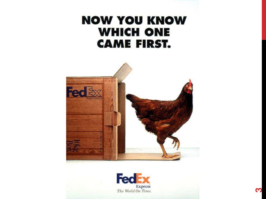
FedEx totally got it right with their witty chicken advertisement. Besides being incredibly funny and attractive, it also incorporated some great typography. A font so heavy that wouldn’t suit any other type of content, turned out to present perfectly the essence of the ad and proved that advertising typography has to be bold.
- Blog posts. When it comes to reading longer texts such as news articles, blog posts, or even books, the number one priority is the readability of the font. Studies show that can vary in different alphabets – meaning a certain font family might look fine in Latin and hard to read in Cyrillic. The general tip here is that the Latin alphabet is more readable in sans serif, while Cyrillic is much better in serif fonts. A small experiment you can do by yourself to check if a font is easy to read and if the letters are distinguishable enough is the IL1 experiment. Just type in Il1 in the desired font and see if each of the characters is recognizable.
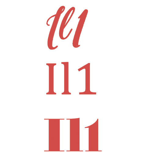
Fig. 4: The Il1 experiment
- Web Design. As a more complex structure, a website incorporates all the different formats we already discussed. On the general content pages it’s smart to follow our blog post advice, while when it comes to the menus and buttons, you can experiment. Keep in mind, though, that no matter how complex a website is, it has to be framed in a single collective design, so that it comes together as one. That’s why it’s better to use similar fonts or ones that complement each other.
- Logos. Here come the logos. When you see them, you either love them right away or you hate them. A logo says more than a thousand words and yet sometimes it fails to send the right message. When choosing a font for your logo, think about your brand identity. Are you sharp and bold, or are you soft and fun? Are you modern and minimal, or are you traditional and gentle? After answering these questions, you’ll be prepared to design a personalized logo that suits your identity as a brand.
To conclude…
As you witnessed, the typography is the skeleton of any design piece. More importantly, it has a great impact on our general attitude towards the content. Creating a certain mood and emotion is what makes the user experience truly delightful and it’s our job as creators to provide that to our users.