

High-school photos. An eternal source of nostalgia and a dreadful reminder of our questionable choices in both life and fashion. From ridiculous hair to unfortunate accessories, we all have a certain period in our past we’re embarrassed about. That’s what I kept thinking about as I took a peek at my old laptop.
And while some mistakes seemed to pave the way for learning and evolving, others were a complete mess which I’d much preferred I had avoided. Which were those mistakes that were to be avoided at any cost in order to achieve our goals?
When it comes to web design, it’s not much different. With technological advancements developing day by day, it’s hard to keep track of all the new trends and more often than not, completely unnecessary. The best strategy here is to find the formula that works for your website’s identity and incorporate trendy bits and bobs every now and then.
Just like the forever classics remain unchanged over the course of time, there are the forever mistakes that have been avoided since the beginning of time. Despite any immense digital innovations, human perception of aesthetics’ main concepts hasn’t altered distinctly in the past centuries and that’s why some mistakes in web design should always be avoided.
Overwhelming Composition
In design, just like in most visual areas, certain modesty rules apply. They’re usually in regards to colors, shapes, styles, and the amount of each in the piece.
Choosing more than two main colors can overwhelm your web design by including too many focus points. Not only people will be distracted but also most probably they’ll be repelled by the excess of stimuli.
Another great deal-breaker is inconsistency. This can be seen in both design and content. When it comes to shapes and colors, different-looking buttons and multicolor text make the brand look unprofessional and unreliable.
THE SOLUTION
To avoid having a silly overwhelming design, try applying the following rules:
- Less is more. Colorwise, the best-performing websites offer no more than two main colors. Because of the power of association, colors can turn the whole website into a recognizable signifier of the offered service.
- Consistency is key. Once you come up with a unique design that represents your brand identity, stay true to it throughout the whole website. Whether it’s buttons or sidebars keep the look authentic.
- Courageous but classy. No one is trying to deprive you of your right to be innovative and creative. The more courage you put into your work, the more original your website will be. Nevertheless, don’t forget to remain classy and maintain the century-long perceptions of aesthetics.
Illegible Fonts
Let’s turn to the example above, once again. Comic Sans has the power to make even the most dramatic statement look like a cartoon and turn the best design into a child’s scribbles.
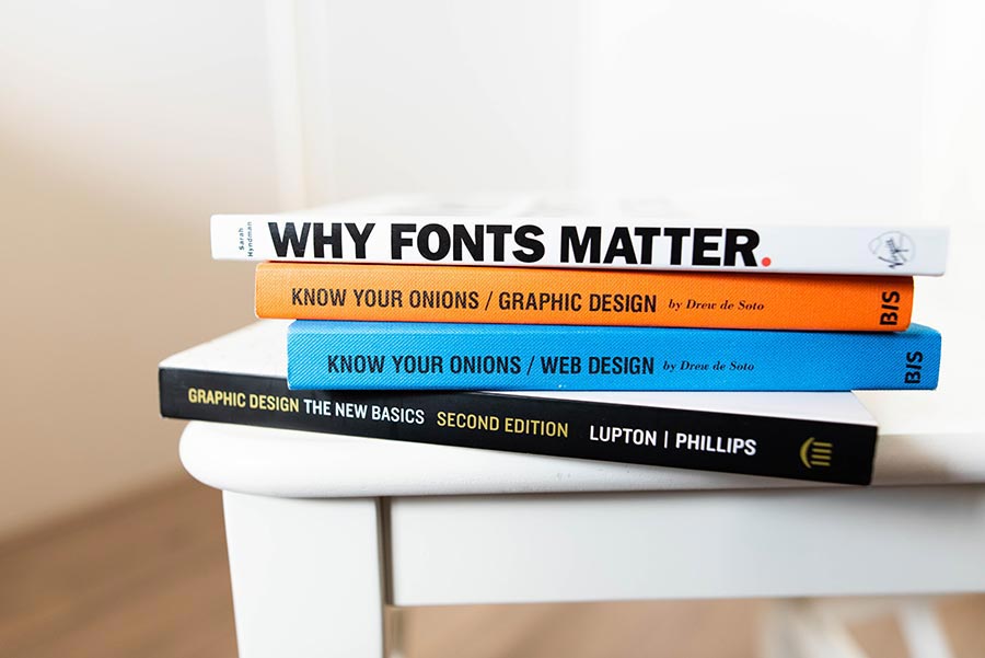
Choosing the right font takes up an immense part of the web designer’s job and deserves special attention when it comes to the possible mistakes threatening a design.
Anything from handwriting to silly decorated fonts makes the whole website seem unprofessional and highly amateur. That, of course, can be avoided and you can prevent the catastrophe by following some simple rules regarding the font’s legibility.
THE SOLUTION
Even though strategies for choosing fonts vary among the different types of websites, there are some undoubtful benefits of doing the following:
- Legibility First. Rely on fonts that are clear and readable and not the ones that might seem exotic and unique. The most important function a text has is its legibility and it should be your number one priority as a designer.
- Convey your Voice. No matter how simple the font is, it’s always a speaking part of your comprehensive design. Your brand’s voice is conveyed through its boldness, size, and specifics.
- Be moderate. Last year proved that font can and does replace images in the new era of bold and heavy typography. Nevertheless, don’t let the trend take you away from the UX, and make sure visitors feel comfortable on your website.
Non-Responsiveness
One of the worst sins in 2018 is to have a website that’s not responsive. Numerous data suggest that users abandon websites that are not responsive. In spite of that, there are still many people who fail to see the necessity of optimizing for mobile.
So what are the consequences of having a website that’s not mobile-friendly? Most importantly, an unfortunate user experience. And as we’ve said multiple times, that can affect all the other SEO indicators.
THE SOLUTION
The solution here might be obvious and yet not that easy to be executed. Some of the possible ways are:
- Responsive Themes. WordPress has numerous advantages and themes are one of the most important ones. Installing a mobile-friendly theme on your WordPress website will ensure that it is displayed well on all devices.
- Manual Responsiveness. From HTML responsive codes to CSS viewport elements, a responsive website can be crafted manually and efficiently. It, however, requires a certain degree of coding knowledge and it’s best to consult a professional when doing it.
Ineffective CTAs
While Call-to-actions are not an immediate web design element, their effect on your overall look is undoubted.

As the main function of the CTAs is to prompt users to undertake a certain action and to conduct a certain behavior on your website, they need to be extremely clear and simple.
Nevertheless, people often tend to overcomplicate their calls to action in their attempt to be more creative and more fun.
THE SOLUTION
Effective calls to action have many things in common and here are some of them:
- Action Indication. The most compelling way to engage people is to use action-oriented language. For instance, instead of naming your button More Info, name it Read More. By that, users will feel personally involved in your CTA.
- Urgency. When given a measurement of time, people are more likely to act upon calls to action. That is due to the immediate visualization of the given action. Words such as now, today, and immediately will allow your visitors to acknowledge the ease of action they can undertake.
- Numbers. Just like the previous point, numbers assist visualization and tangibility of the action. Concrete digits make that action seem much more specific and therefore, doable.
In this day and age, when pluralism seems to have overtaken all of the areas of our perception, it’s hard to defy the borders of aesthetic concepts.
Nevertheless, common sense often hints us the right way when it comes to design and visuals. While trends come and go, those timeless strategies remain persistent and effective throughout the course of time.
While some mistakes can definitely shed a light in the right direction and reward us with more courage, others deserve to be avoided at any cost. These mistakes in web design can act as an actual deal-breaker and it’s up to you to learn how to escape from them.