

Everybody loves a good trip, right!? And website heatmap tracking is the best you can take for your website’s sake. The benefits you’ll find are a lot and your overlook of things might change even more.
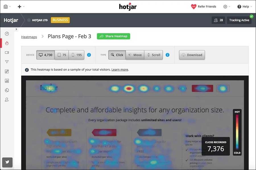
A website heatmap is following the clicking and browsing behavior of your users. It helps you establish the hot (portions of your website that users click on or like the most) and cold (portions of your website that users do not pay much attention to) areas of the website.
This means you can make assumptions about the way your website is designed, where the important information is, what people look at and what takes their interest.
Most Important Content Goes On the Top
When you look at a website heatmap, you’ll find out that people scroll down but their attention is kept only at the beginning of the page.
In a recent study was found that user viewing time was distributed as follows:
Above the fold: 80.3%
Below the fold: 19.7%
The numbers above should be enough to convince you that the most important content needs to be on the top. However, every website has different agendas, structures, and messages, so when you explore your website heatmap you’ll be able to see for yourself which parts of your content are more read than others and concentrate the important content there.
This doesn’t mean you have to keep all of the content on the top, and not write useful content lower than the fold. However, try starting always from the important as you go down to the less important information.
Bottom Importance
People tend to scroll down the information that is the core of the article or the content on the page but stop again at the end of the page. They find it interesting to spend a few seconds there as a lot of developers put important information there too. So, a good call to action can drive more conversions and boost your sales.
F-Shaped Pattern Read
And while we’re talking about how people read and where they spend the most time, you have to know how they look at the information.
“In the F-shaped scanning pattern is characterized by many fixations concentrated at the top and the left side of the page. Specifically:
– Users first read in a horizontal movement, usually across the upper part of the content area. This initial element forms the F’s top bar.
– Next, users move down the page a bit and then read across in a second horizontal movement that typically covers a shorter area than the previous movement. This additional element forms the F’s lower bar.
– Finally, users scan the content’s left side in a vertical movement. Sometimes this is a slow and systematic scan that appears as a solid stripe on an eyetracking heatmap. Other times users move faster, creating a spottier heatmap. This last element forms the F’s stem.”
Source: NNGroup.
This knowledge of the F-shaped patterns helps us one more time to structure well the look of a page. If it is an article we’re talking about, users will read mostly headlines and assume it’s the essence of the content.
Use as many as possible subheadings, bullet points, and paragraphs to make your content more readable and users will appreciate that.
Imagine Your Audience
Imagination is a powerful thing. Sometimes it can be beautiful, inspiring, and interesting. But other times it can lead to misjudging and wrongful conclusions.

This is why you can use website heatmap tracking to understand better your users. You can easily see where they click most, what is most interesting for them, and collect the information for them.
Audience segmentation is one of the most important parts of marketing in general. It gives you the right direction to look at and helps boost traffic, and grow sales, and success.
So, when you open the website heatmap and look at the hot areas, see behind them. Look at every user that clicks somewhere, where did they stop, where did the cursor of the mouse pointer. Everything matters. Think like them and you’ll know what to do.
The Power of Images
It’s no secret that images on every page earn a lot of looks. Users just find it easier to understand content when there are photos or graphics around them. So, do know that they are powerful and attract attention.
Make sure you use good contrasts, and always images of high quality, and perfectly suitable for the content around them. This way boosting the conversion rate is more possible.
Another important tip to follow is using images with real people on them. Studies show that users respond a lot better when the images are of people and you want that, right?
Furthermore, notice the direction that people in the photos are looking at. If it’s straight at the user, good. But if they’re looking left, position the image as the look of the person is showing something on the left side of the page.
Positions Matter
It is proven that the left side of a website page gets more of the visitors’ attention. They look at it first and hold it there as they go down. This, combined with the F-shaped read pattern, shows that you need to keep it as a good starting point.
Users are used to finding the more important information on the left and the other – on the right. Except if the site is center orientated. Then you can use the space on the right for banners that are advertising or leave it blank and still keep the interest on the important part.
Another valuable matter is the fact that people buy what they see first. You might not trust me on this, but it is true. When in a hurry and entering a site with a lot of items for sale, they’ll not spend too much time searching. They will concentrate on what they see.
The same goes for articles. They’ll read the first they find. Which reminds me, keep a list of the content and not the full articles. It’s a better user experience to look at headlines for example with photos and choose what to read. Instead of scrolling down forever.
To Conclude
Website heatmap is extremely important when you want to optimize your conversion rate. First, check every once in a while, the picture with hot and cold areas to make sure your users’ experience is good. Then, also check the clicks you get from them and figure out what is easy for them, and what is not. In the end, make a plan and fix what needs to be fixed. Have a great website!