

Whether you are a developer or just a regular web user, you have more than surely stumbled upon the trend that seems to have taken over web design in the past few years.
While previously, scrolling was considered a rather mundane activity, and the interactive process with it was limited to the (cringe-worthy) cursor modification, today we are proud to witness the new age of fluid and dynamic web design.
Parallax scrolling has been dominating the trends in UX design for one simple reason – it allows the user to interact with the page. Moreover, the feeling of partaking in a three-dimensional reality while investing as little effort as simply scrolling down reflects the desire of web users to be both active and to avoid exertion on their digital journey.
Even though the overall “feeling” of the parallax effect is familiar to most of us, when asked to explicitly define it, most of the users find it hard to put it into words. So, what is parallax scrolling after all?

What is Parallax Scrolling and How Does it Work?
Considering that the trick originated from video game graphics, it is worth mentioning its application in that context. Wikipedia defines parallax scrolling as:
a technique in computer graphics where background images move past the camera more slowly than foreground images, creating an illusion of depth in a 2D scene and adding to the sense of immersion in the virtual experience.
This illusion of depth simulated the effect of three-dimensional graphics.
Entering the field of web design, parallax kept its main features but the ways to produce and perceive it changed. One of the most popular uses of parallax became scrolling.
Parallax scrolling is a method to achieve a parallax animation where the foreground moves faster than the background. Through this perception of difference in speed, the landscape receives more depth and fluidity.
However, not every action or animation triggered by scrolling can be called parallax. What is required for it to fit into the definition is the perception of two objects differing in depth and speed. This created illusion has the capacity to grab the attention of the forever-scrollers and enhance UX.
Why Do You Need Parallax Scrolling?
Trends are usually either followed blindly or rendered trivial by critics and avoided altogether. There is, however, a reason for a collective interest in certain things at a particular point in time.
History unfolds before our eyes to show that humanity develops in mutually- determinant stages which couldn’t help but result in particular trends and events. That is why the cause for the occurrence of these trends is rooted in the expectation for the upcoming. That is also why incorporating trends in one’s life allows him not only to merely fulfill certain contemporary requirements for adequacy but also to partake in the overall turn of events.
So, what can parallax scrolling contribute to your website’s design and how are other people doing it? How to combine a beautiful design with performance optimization?
Attention-Grabber
To achieve a positive user experience design, one must abandon the mythological imperative about the book and its cover. The belief of content making the whole difference, while true, fails to recognize the cognitive effect web design can have on the viewers.
Attention grabbers are visual elements such as graphics, typography, and images that can attract the wandering eye of the users. By incorporating a somewhat unexpected scrolling feature, you can enhance the attention dedicated to your web page while still maintaining the focus on the content.

On the iStrategyLabs Review website, the parallax effect is quite apparent.
Appealing not only to the users’ informational needs but also to their aesthetic ones allows web designers to Appealing not only to the users’ informational needs but also to their aesthetic ones, allowing web designers to enhance the overall experience of the visitors and assist the effectiveness of the page.
Space Utilization
A great designer once told me that blank spaces matter as much in web design as silence does in communication. The lack of sensory input has just as much capacity to convey messages as the actual input.
That is why space utilization plays a grandiose role in web design and parallax incorporation is proof of that.
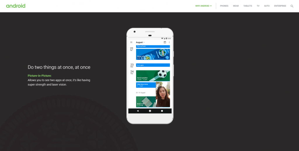
Android’s 8.0 Oreo page utilizes both horizontal and vertical space.
Space utilization means that not only the design is appealing and coherent but also it manages to distribute its elements in a way that utilizes the website’s space optimally.
A parallax effect has a lot to offer to space utilization as it can incorporate larger visual messages in smaller spaces. Through scrolling, however, the images can be revealed which will allow the design to remain as fluid as possible.
Modern Feeling
As we have mentioned, trends are not only contagious but also inevitable at times. They have the capacity to refresh the design when revamping a website and improve the relevance perceived by the users.
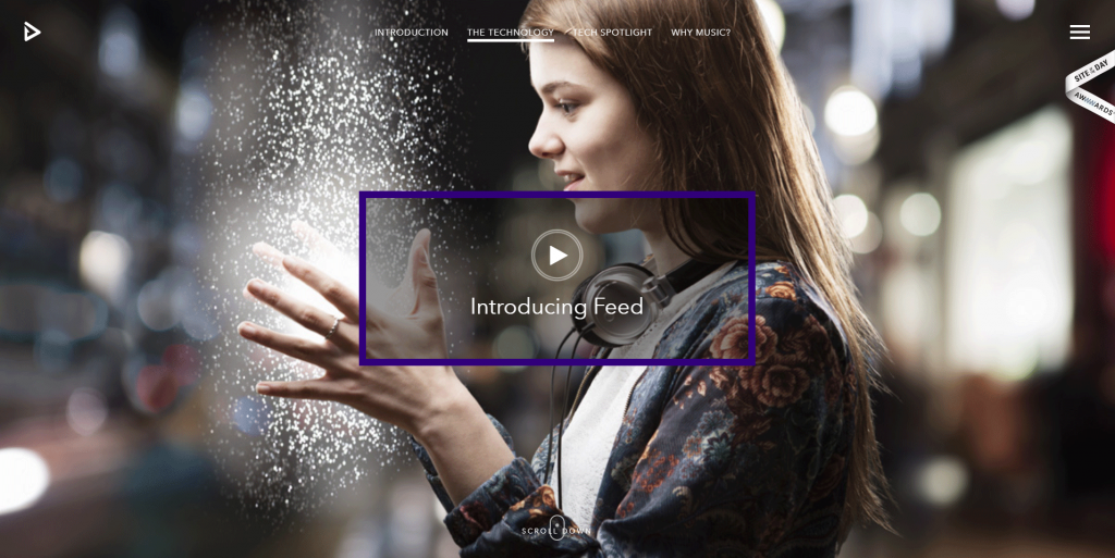
Feedmusic’s website incorporates a large variety of scrolling effects
Design tends to get sharper and bolder with time and following some simple guidelines for having a contemporary-looking website could be a game-changer for your user experience.
Most importantly, innovations increase your relevance and credibility as a responsible and reliable brand that takes care of its design and its visitors’ journey. Parallax might seem like a detail too small to deserve your full attention but it is, after all, a small investment of time and effort which will eventually repay in the future.