

Web design is like a Maths class.
When you finally think you got it, a bunch of new stuff appears proving you wrong.
We all know the struggle of keeping up with the latest web design trends. Learning to recognize the tendencies of the new elements, however, can turn you into an original and innovative designer grasping the concept of those trends.
In 2017, there have been some impressive trends that kept developing and spreading across the web. Let’s take a look at the biggest web design trends that framed our design vision in the past nine months.
1. Responsiveness. Good new responsiveness.
If three years ago someone had told me that content was going to be designed for mobile devices first and only then constructed to fit desktop users, I wouldn’t believe it. Well, it’s a fact in 2017 you can’t neglect.
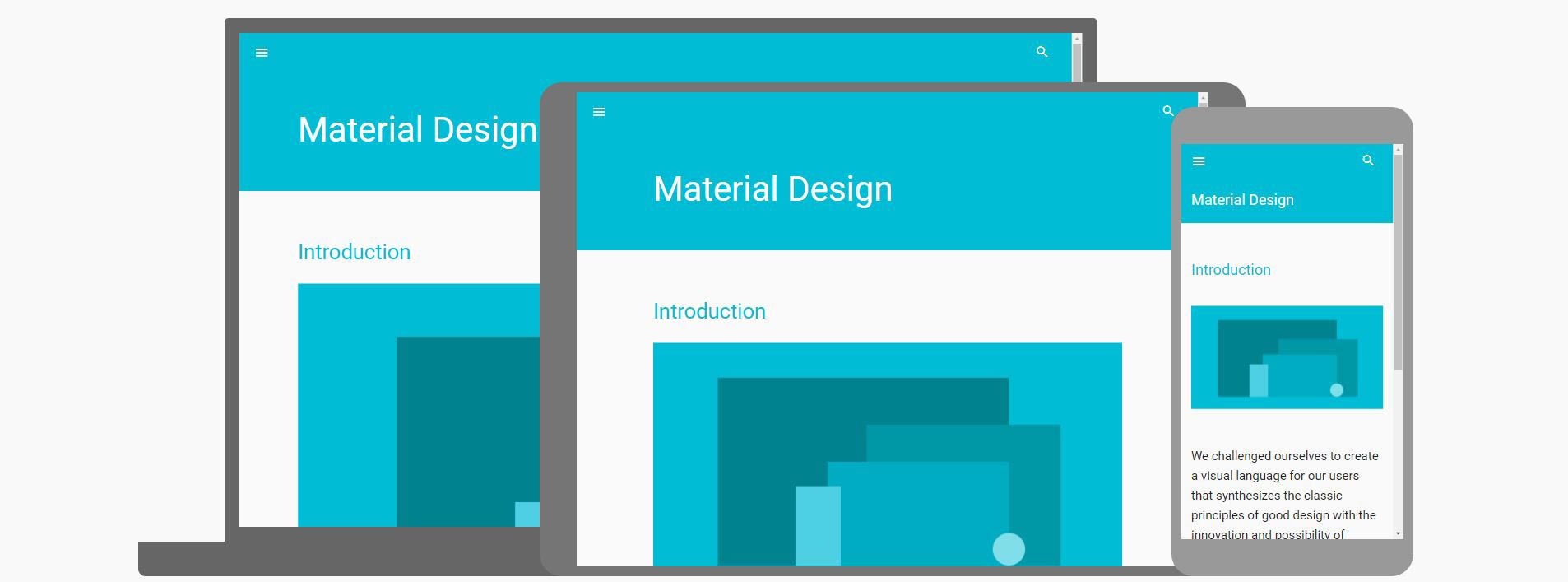
Today, responsiveness has a multi-layered purpose, and only focusing on one of them might leave your work incomplete.
First and foremost, a responsive design means you reduce the costs of developing different websites. In other words, companies pay for a single website while receiving content suitable not only for desktop but also mobile and tablets.
Another huge advantage of embracing a responsive design lies in its inclusiveness. If a few years ago it seemed impossible to enjoy the full potential of the web only through your mobile device, now more and more users are using only their smartphones. Having a responsive website means that you expand your prospective audience by including all device owners.
Flexible Experimental Layouts
Blame it on mobile devices because the good old grid seems outdated today. This means that one of the biggest web design trends for the year is “breaking the grid”.
Layouts have never had more fluid and experimental looks. Spicing the design by overlapping, resizing, and moving objects creates a feeling of vitality and sharpness. Essentially, the more unpredictable you are in the means of size, shape, and layout, the more enjoyable your user experience is.
Fubiz.net incorporates all of the mentioned in an incredibly simplistic yet dynamic layout. The grid is broken by changing the number of the columns unexpectedly, overlapping, and by shadowing.
SVG
As opposed to the other image file types (such as JPEG, PNG, and GIF), SVG files are vector formats, and not raster. This means that they’re constructed by lines and curves instead of pixels.
There are, in fact, numerous advantages of using SVG in web design.
- incredibly responsive. Being vector file type means that no matter how much you zoom in, you’ll still see lines and curves as opposed to pixels. Thereof, all of the devices will display the image with the same quality and sharpness.
- small file size. Even though the image might appear large on screens, its size remains small which assists the speed of your website.
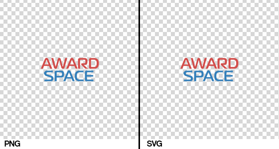
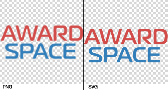
All of the images above have the same file size but when you zoom in on the SVG file its quality remains high without enlarging the size.
SVGs are gaining more and more popularity in web design and incorporating them into your own website through logo or illustrations means that it will stay up to date with the innovations.
Prototyping Tools
Even though prototyping tools themselves aren’t an actual trend in the web design, they’re still one of the elements in web design that is spreading rapidly.
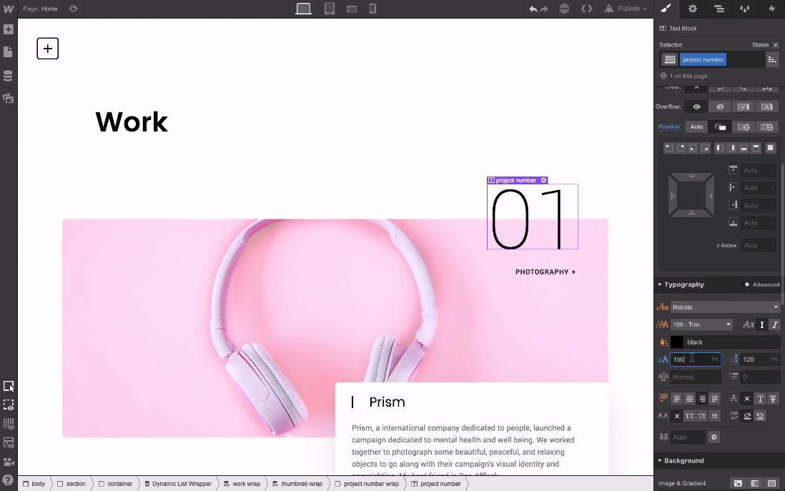
Tools such as Webflow and UXPin are huge at the moment as they allow you to prototype and design your website with all its working features. By quickly creating working prototypes, you’re able to measure their functionality, design, and aesthetics sparing yourself the troubles of coding.
2. I like to move it, move it.
Contemporary web designers would make Newton proud as they firmly apply dynamics principles wherever possible. This year nothing is static. From Facebook add a GIF button to comments on Youtube including a preview in the thumbnails.
Gone are the days when you needed to use your imagination to attribute life and movement to imagery. Now it’s all cooked and prepared in the designer’s mind beforehand. There are three main forms where movement can be applied:
Video
You might think that video has been around for quite a while but in fact, it has never had the influence it has right now. Web design is all about WebM formats and it seems like they’re here to stay.
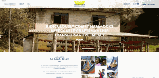
YellowLeaf Hammocks’ About page
Quick tip: When uploading an HTML5 video make sure to provide both WebM and MP4 formats to ensure that your video will be supported on all devices.
Animations
Admit it, you too become a child when you hover over something and it has an animation! Such a simple and yet effective touch has an incredible impact on your UX. Whether it’s the reminiscence of our school presentations, or something else, the animated objects keep getting more and more popular among contemporary designers.
Some of the options to consider when incorporating animations into your websites are:
-
- GIFs
- motions on click or hover
- animated loading
- or why not some incredibly creative 404 pages?
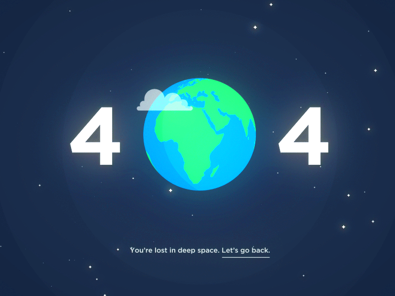
Credit: Tylor Milne
Parallax
Lately, in our office, all you can hear is “Parallax this, parallax that.” In other words, we apply it a lot. So do most of the web designers today as it breaks the expectation of the user and creates the feeling of being accompanied during his journey.
One of my favorite examples of great parallax usage lately has been Android’s 8.0 Oreo page. Such a simple and yet effective touch can step your game up in the blink of an eye.
3. Go bold or go home.
One of the most influential web design trends for 2017 has been the usage of bold and heavy visual elements as a balancing entity to the minimalism that had overtaken the web in the past year.
That is actually how it all started – as an attempt at a balanced design vision. This year, however, has proved to be going above and beyond any expectations, and just like fashion, art, and graphic design, web design has embraced the “the more, the better” motto. Being bold and brave has never been so artistically implemented and we can see it everywhere.
Heavy Typography
With people’s attention span dwindling away with each passing year, designers and marketers need to find a way to grab it and bring it back where it belongs.
One of the most efficient strategies here is oversized typography. While scanning through the content on the web, on social media, or on the website itself, the daring letters definitely grab your eye. From a mere instrument, typography has turned into a key visual this year.
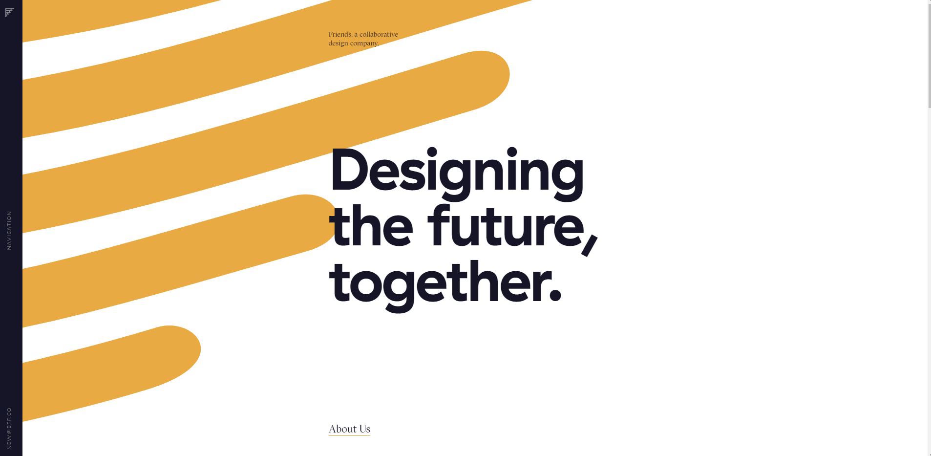
The Home page of the design agency Friends.
Heavy Typography. It’s not that you need it to see better, it’s that when you see it you can’t look away. And that already is a goal achieved.
Color Pop
With the comeback of the 70s in all areas of design, it was impossible for web design to remain unaffected. Bold and daring colors have proved to go a long way during this year as a major trend company has been following.
There are two main trends regarding color:
- Duotones
Have you seen Spotify lately? They’ve been all about that duotone magic happening right now. Implementing two colors into your web design provides the necessary combination of flexibility and continuity that brings all the pieces together. When it comes to pictures we can see some kind of that good old negative effect in those same two colors.
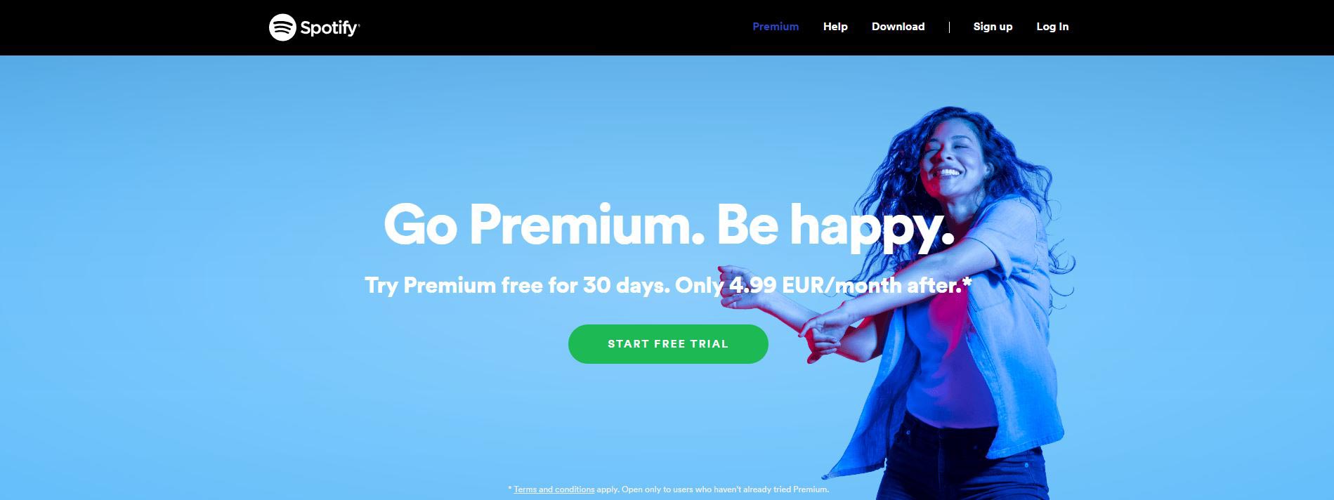
Blue and purple are Spotify’s choices for this season.
- Bright Colors
Choosing the right color for your website is one of the most important decisions you make while designing it. Colors influence our emotions, perceptions, and opinions, and most importantly they convey a message. As 2017 has been the year of courageous design, that’s what the web design trends regarding colors are. Bright contrasting colors, and bold hues juxtaposed with muted environments. Pantone has already unveiled their choice for 2017 Color of the year. It’s called Greenery and its impact is already visible on many websites.

Pantone has also come up with quite a few color combinations for Greenery to inspire you in case you decide to accommodate the color into your design. The rule of “bold on muted” applies here fully, as well.
To summarize:
2017 has been one of the most daring years in terms of web design trends so far. It has managed to push the boundaries of our attention-grabbing tools, to make responsiveness the number one priority, and challenge our vision of balance and complementary colors.
We can’t be sure what’s there to come until the end of the year but we know for a fact that design is about perceiving the absent and daring to change your point of view to make a difference.